Exemplo
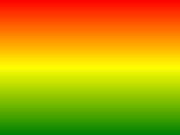
O exemplo a seguir mostra um gradiente linear que começa no topo. Ela começa vermelho, a transição para amarelo, depois para azul:
#grad {
background: -webkit-linear-gradient(red,yellow,blue); /* Safari 5.1-6.0 */
background: -o-linear-gradient(red,yellow,blue); /*
Opera 11.1-12.0 */
background: -moz-linear-gradient(red,yellow,blue); /*
Firefox 3.6-15 */
background: linear-gradient(red,yellow,blue); /* Standard
syntax */
}
Tente você mesmo " Definição e Uso
O linear-gradient() função cria uma "image" que representa um gradiente linear de cores.
Para criar um gradiente linear você deve definir pelo menos duas paradas de cor. paradas de cores são as cores que deseja para tornar transições suaves entre. Você também pode definir um ponto de partida e uma direção (or an angle) , juntamente com o efeito de gradiente.
Exemplo de gradiente linear:
| Versão: | CSS3 |
|---|
Suporte a navegadores
Os números na tabela especificar a primeira versão do browser que suporta totalmente a função.
Números seguido por -webkit-, -moz-, ou O- especificar a primeira versão que trabalhou com um prefixo.
| Função | |||||
|---|---|---|---|---|---|
| linear-gradient() | 26,0 10,0 -webkit- | 10.0 | 16,0 3.6 -moz- | 6.1 5.1 -webkit- | 12.1 11,1 -o- |
CSS Syntax
background: linear-gradient( direction , color-stop1 ,
color-stop2, ... );
| Valor | Descrição |
|---|---|
| direction | Define um ponto de partida e uma direcção (or an angle) , juntamente com o efeito de gradiente. |
| color-stop1, color-stop2,... | paradas de cores são as cores que deseja para tornar transições suaves entre. Este valor é constituída por um valor de cor, seguido de uma posição de paragem opcional (a percentage between 0% and 100% or a length along the gradient axis) . |

mais Exemplos
Exemplo
Um gradiente linear que começa a partir da esquerda. Ela começa vermelho, a transição para o azul:
#grad {
background: -webkit-linear-gradient(left,
red , blue); /* Safari 5.1 to 6.0 */
background: -o-linear-gradient(right, red,
blue); /* Opera 11.1 to 12.0 */
background: -moz-linear-gradient(right,
red, blue); /* Firefox 3.6 to 15 */
background: linear-gradient(to
right, red , blue); /* Standard syntax */
} Tente você mesmo " Exemplo
Um gradiente linear que começa no canto superior esquerdo (and goes to bottom right) :
#grad {
background: -webkit-linear-gradient(left
top, red , blue); /* Safari 5.1 to 6.0 */
background: -o-linear-gradient(bottom
right, red, blue); /* Opera 11.1 to 12.0 */
background: -moz-linear-gradient(bottom
right, red, blue); /* Firefox 3.6 to 15 */
background:
linear-gradient(to bottom right, red , blue); /* Standard syntax */
} Tente você mesmo " Exemplo
Um gradiente linear com um ângulo especificado:
#grad {
background: -webkit-linear-gradient(180deg,
red, blue); /* Safari 5.1 to 6.0 */
background: -o-linear-gradient(180deg, red,
blue); /* Opera 11.1 to 12.0 */
background: -moz-linear-gradient(180deg,
red, blue); /* Firefox 3.6 to 15 */
background:
linear-gradient(180deg, red, blue); /* Standard syntax */
} Tente você mesmo " Exemplo
Um gradiente linear com múltiplas paragens de cores:
#grad {
/* For Safari 5.1 to 6.0 */
background: -webkit-linear-gradient(left,red,orange,yellow,green,blue,indigo,violet);
/* For Opera 11.1 to 12.0 */
background:
-o-linear-gradient(left,red,orange,yellow,green,blue,indigo,violet);
/*
For Fx 3.6 to 15 */
background: -moz-linear-gradient(left,red,orange,yellow,green,blue,indigo,violet);
/* Standard syntax */
background: linear-gradient(to right,
red,orange,yellow,green,blue,indigo,violet);
} Tente você mesmo " Exemplo
Um gradiente linear com a transparência:
#grad {
background: -webkit-linear-gradient(left,rgba(255,0,0,0),rgba(255,0,0,1)); /*Safari
5.1-6*/
background:
-o-linear-gradient(right,rgba(255,0,0,0),rgba(255,0,0,1)); /*Opera 11.1-12*/
background: -moz-linear-gradient(right,rgba(255,0,0,0),rgba(255,0,0,1));
/*Fx 3.6-15*/
background: linear-gradient(to right, rgba(255,0,0,0),
rgba(255,0,0,1)); /*Standard*/
} Tente você mesmo " Páginas relacionadas
Tutorial CSS: CSS3 gradientes
 Funções CSS Reference