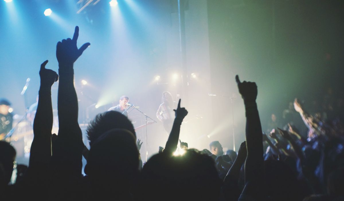
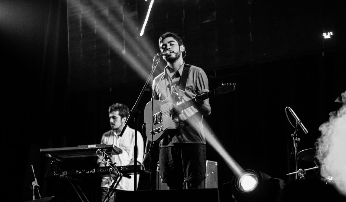
Create a Theme: "The Band"
This page will show you how to build a Bootstrap theme from scratch.
We will start with a simple HTML page, and then add more and more components, until we have a fully functional, personal and responsive website.
The result will look like this, and you are free to modify, save, share, use or do whatever you want with it:
HTML Start Page
We will start with the following HTML page:
<!DOCTYPE html>
<html lang="en">
<head>
<title>Bootstrap
Theme The Band</title>
<meta charset="utf-8">
</head>
<body>
<div>
<h3>THE BAND</h3>
<p>We love music!</p>
<p>We have created a fictional band website. Lorem ipsum..</p>
</div>
</body>
</html>
Add Bootstrap CDN and Add a Container
Add Bootstrap CDN and a link to jQuery and put HTML elements inside a
container
(.container):
Example
<!DOCTYPE html>
<html lang="en">
<head>
<title>Bootstrap
Theme The Band</title>
<meta charset="utf-8">
<meta name="viewport"
content="width=device-width, initial-scale=1">
<link rel="stylesheet"
href="http://maxcdn.bootstrapcdn.com/bootstrap/3.3.6/css/bootstrap.min.css">
<script src="https://ajax.googleapis.com/ajax/libs/jquery/1.12.0/jquery.min.js"></script>
<script src="http://maxcdn.bootstrapcdn.com/bootstrap/3.3.6/js/bootstrap.min.js"></script>
</head>
<body>
<div class="container">
<h3>THE BAND</h3>
<p>We love music!</p>
<p>We have
created a fictional band website. Lorem ipsum..</p>
</div>
</body>
</html>
Result:
THE BAND
We love music!
We have created a fictional band website. Lorem ipsum..
Center Text
Add the .text-center class to center the text inside the
container, and use the <em> element to make the "We love music" text italic:
Example
<div class="container text-center">
<h3>THE BAND</h3>
<p><em>We love music!</em></p>
<p>We have
created a fictional band website. Lorem ipsum..</p>
</div>
Result:
THE BAND
We love music!
We have created a fictional band website. Lorem ipsum..
Add Padding
Use CSS to make the container look good with padding:
Example
.container {
padding: 80px 120px;
}
Result:
THE BAND
We love music!
We have created a fictional band website. Lorem ipsum..
Add a Grid
Create three columns of equal width (.col-sm-4), add text and
images, and put them inside the container:
Example
<div class="container text-center">
<h3>THE BAND</h3>
<p><em>We
love music!</em></p>
<p>We have created a fictional band website.
Lorem ipsum..</p>
<br>
<div class="row">
<div class="col-sm-4">
<p><strong>Name</strong></p><br>
<img src="bandmember.jpg" alt="Random Name">
</div>
<div class="col-sm-4">
<p><strong>Name</strong></p><br>
<img src="bandmember.jpg" alt="Random Name">
</div>
<div class="col-sm-4">
<p><strong>Name</strong></p><br>
<img src="bandmember.jpg" alt="Random Name">
</div>
</div>
</div>
Result:
THE BAND
We love music!
We have created a fictional band website. Lorem ipsum..
Name

Name
Name
Circle Image
Shape the image to a circle with the .img-circle class.
We have also added some CSS to make the images look good:
Example
.person {
border: 10px solid transparent;
margin-bottom: 25px;
width: 80%;
height: 80%;
opacity: 0.7;
}
.person:hover {
border-color: #f1f1f1;
}
<img src="bandmember.jpg"
class="img-circle person" alt="Random Name">
<img src="bandmember.jpg"
class="img-circle person" alt="Random Name">
<img src="bandmember.jpg"
class="img-circle person" alt="Random Name">
Result:
Name
Name
Name
Collapsibles
Make the images collapsible; show extra content when you click on each image:
Example
<div class="row">
<div class="col-sm-4">
<p
class="text-center"><strong>Name</strong></p><br>
<a href="#demo"
data-toggle="collapse">
<img src="bandmember.jpg" class="img-circle person"
alt="Random Name">
</a>
<div id="demo"
class="collapse">
<p>Guitarist and Lead Vocalist</p>
<p>Loves long
walks on the beach</p>
<p>Member since 1988</p>
</div>
</div>
<div class="col-sm-4">
<p class="text-center"><strong>Name</strong></p><br>
<a href="#demo2" data-toggle="collapse">
<img src="bandmember.jpg" class="img-circle
person" alt="Random Name">
</a>
<div id="demo2"
class="collapse">
<p>Drummer</p>
<p>Loves drummin'</p>
<p>Member
since 1988</p>
</div>
</div>
<div class="col-sm-4">
<p
class="text-center"><strong>Name</strong></p><br>
<a href="#demo3"
data-toggle="collapse">
<img src="bandmember.jpg" class="img-circle person"
alt="Random Name">
</a>
<div id="demo3"
class="collapse">
<p>Bass player</p>
<p>Loves math</p>
<p>Member
since 2005</p>
</div>
</div>
</div>
Result (click on the images to see the effect):
Name
Guitarist and Lead Vocalist
Loves long walks on the beach
Member since 1988
Name
Drummer
Loves drummin'
Member since 1988
Name
Bass player
Loves math
Member since 2005
Add a Carousel
Create a carousel and add it before the container:
Example
<div id="myCarousel" class="carousel slide" data-ride="carousel">
<!-- Indicators -->
<ol class="carousel-indicators">
<li data-target="#myCarousel" data-slide-to="0" class="active"></li>
<li data-target="#myCarousel" data-slide-to="1"></li>
<li data-target="#myCarousel" data-slide-to="2"></li>
</ol>
<!-- Wrapper for slides -->
<div class="carousel-inner"
role="listbox">
<div class="item active">
<img src="ny.jpg" alt="New York">
<div class="carousel-caption">
<h3>New York</h3>
<p>The atmosphere in New York is lorem ipsum.</p>
</div>
</div>
<div
class="item">
<img src="chicago.jpg"
alt="Chicago">
<div
class="carousel-caption">
<h3>Chicago</h3>
<p>Thank you, Chicago - A night we won't forget.</p>
</div>
</div>
<div
class="item">
<img src="la.jpg"
alt="Los Angeles">
<div
class="carousel-caption">
<h3>LA</h3>
<p>Even though the traffic was a mess, we had the best time.</p>
</div>
</div>
</div>
<!--
Left and right controls -->
<a class="left carousel-control" href="#myCarousel"
role="button" data-slide="prev">
<span class="glyphicon
glyphicon-chevron-left" aria-hidden="true"></span>
<span class="sr-only">Previous</span>
</a>
<a
class="right carousel-control" href="#myCarousel" role="button"
data-slide="next">
<span class="glyphicon glyphicon-chevron-right"
aria-hidden="true"></span>
<span class="sr-only">Next</span>
</a>
</div>
Result:
New York
The atmosphere in New York is lorem ipsum.
Chicago
Thank you, Chicago - A night we won't forget.

LA
Even though the traffic was a mess, we had the best time playing at Venice Beach!
Style The Carousel
Use CSS to style the carousel:
Example
.carousel-inner img {
-webkit-filter:
grayscale(90%);
filter: grayscale(90%); /* make all photos black and
white */
width: 100%; /* Set width to 100% */
margin: auto;
}
.carousel-caption h3 {
color: #fff !important;
}
@media
(max-width: 600px) {
.carousel-caption {
display: none; /* Hide the
carousel text when the screen is less than 600 pixels wide */
}
}
Result:
New York
The atmosphere in New York is lorem ipsum.
Chicago
Thank you, Chicago - A night we won't forget.
LA
Even though the traffic was a mess, we had the best time playing at Venice Beach!
Add Tour Container
Add a new container and add a list (.list-group and .list-group-item) inside
of it.
Add a custom class (.bg-1) to the container (black background color) and some
styles to
its children:
Example
<style>
.bg-1 {
background: #2d2d30;
color: #bdbdbd;
}
.bg-1 h3 {color: #fff;}
.bg-1 p {font-style:
italic;}
</style>
<div class="bg-1">
<div
class="container">
<h3 class="text-center">TOUR
DATES</h3>
<p class="text-center">Lorem ipsum we'll
play you some music.<br> Remember to book your tickets!</p>
<ul class="list-group">
<li
class="list-group-item">September Sold Out!</li>
<li class="list-group-item">October Sold Out!</li>
<li class="list-group-item">November 3</li>
</ul>
</div>
</div>
Result:
TOUR DATES
Lorem ipsum we'll play you some music.
Remember to book your tickets!
- September Sold Out!
- October Sold Out!
- November 3
Add Labels & Badges
Add a label (.label) and a badge (.badge) to highlight available tickets/sold out:
Example
<ul class="list-group">
<li class="list-group-item">September
<span class="label label-danger">Sold Out!</span></li>
<li
class="list-group-item">October <span class="label label-danger">Sold
Out!</span></li>
<li class="list-group-item">November <span
class="badge">3</span></li>
</ul>
Result:
TOUR DATES
Lorem ipsum we'll play you some music.
Remember to book your tickets!
- September Sold Out!
- October Sold Out!
- November 3
Add Thumbnail Images
Inside the Tour container, add three columns of equal width (.col-sm-4):
Inside each column, add an image.
Then, use the .img-thumbnail class to shape the image to a thumbnail.
Normally, you would add the .img-thumbnail class directly to the
<img> element. In this example, we have placed a thumbnail container around the image, so that we can specify an image text as well.
Example
<div class="row text-center">
<div class="col-sm-4">
<div
class="thumbnail">
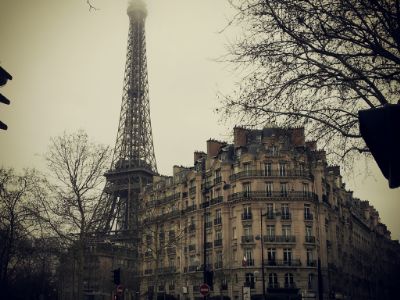
<img src="paris.jpg" alt="Paris">
<p><strong>Paris</strong></p>
<p>Fri. 27 November 2015</p>
<button
class="btn">Buy Tickets</button>
</div>
</div>
<div class="col-sm-4">
<div class="thumbnail">
<img
src="newyork.jpg" alt="New York">
<p><strong>New
York</strong></p>
<p>Sat. 28 November 2015</p>
<button class="btn">Buy Tickets</button>
</div>
</div>
<div class="col-sm-4">
<div class="thumbnail">
<img src="sanfran.jpg"
alt="San Francisco">
<p><strong>San
Francisco</strong></p>
<p>Sun. 29 November 2015</p>
<button class="btn">Buy Tickets</button>
</div>
</div>
</div>
Result:
Paris
Fri. 27 November 2015

New York
Sat. 28 November 2015

San Francisco
Sun. 29 November 2015
Style Lists, Thumbnails & Buttons
Use CSS to style the list and the thumbnail images. In our example, we have removed the rounded borders from the list and we have tried to make the thumbnail images like cards, by removing their border, and set a 100% width on each image.
We have also modified the default styles of Bootstrap's .btn class, to a black button:
Example
/* Remove rounded borders from list */
.list-group-item:first-child {
border-top-right-radius: 0;
border-top-left-radius: 0;
}
.list-group-item:last-child {
border-bottom-right-radius: 0;
border-bottom-left-radius: 0;
}
/* Remove border and add padding
to thumbnails */
.thumbnail {
padding: 0 0 15px 0;
border: none;
border-radius: 0;
}
.thumbnail p {
margin-top: 15px;
color: #555;
}
/* Black buttons with extra padding and without rounded borders */
.btn {
padding: 10px 20px;
background-color: #333;
color: #f1f1f1;
border-radius: 0;
transition: .2s;
}
/* On
hover, the color of .btn will transition to white with black text */
.btn:hover, .btn:focus {
border: 1px solid #333;
background-color: #fff;
color: #000;
}
Result:
- September Sold Out!
- October Sold Out!
- November 3
Paris
Fri. 27 November 2015
New York
Sat. 28 November 2015
San Francisco
Sun. 29 November 2015
Add a Modal
First, change all buttons inside the thumbnail from <button class="btn">Buy Tickets</button>
to <button class="btn" data-toggle="modal"
data-target="#myModal" >Buy Tickets</button>. These
buttons are used to open the actual modal.
To create the modal, look at the following code:
Example
<style>
/* Add a dark gray background color to the modal header and
center text */
.modal-header, h4, .close {
background-color: #333;
color: #fff !important;
text-align: center;
font-size: 30px;
}
.modal-header, .modal-body {
padding: 40px 50px;
}
</style>
<!-- Used to open the Modal -->
<button class="btn" data-toggle="modal" data-target="#myModal">Buy
Tickets</button>
<!-- Modal -->
<div class="modal fade" id="myModal"
role="dialog">
<div class="modal-dialog">
<!-- Modal content-->
<div class="modal-content">
<div class="modal-header">
<button type="button" class="close"
data-dismiss="modal">×</button>
<h4><span class="glyphicon
glyphicon-lock"></span> Tickets</h4>
</div>
<div class="modal-body">
<form role="form">
<div
class="form-group">
<label for="psw"><span class="glyphicon glyphicon-shopping-cart"></span>
Tickets, $23 per person</label>
<input type="number" class="form-control"
id="psw" placeholder="How many?">
</div>
<div class="form-group">
<label for="usrname"><span class="glyphicon glyphicon-user"></span> Send
To</label>
<input type="text" class="form-control" id="usrname"
placeholder="Enter email">
</div>
<button type="submit" class="btn btn-block">Pay
<span class="glyphicon glyphicon-ok"></span>
</button>
</form>
</div>
<div class="modal-footer">
<button type="submit" class="btn btn-danger
btn-default pull-left" data-dismiss="modal">
<span class="glyphicon glyphicon-remove"></span>
Cancel
</button>
<p>Need <a href="#">help?</a></p>
</div>
</div>
</div>
</div>
Result (click on the "Buy Tickets" button to see the effect):
Add Contact Container
Create a new container, with two columns of unequal width (.col-md-4 and .col-md-8).
Add informational icons with text inside the first column and form controls in the second:
Example
<div class="container">
<h3 class="text-center">Contact</h3>
<p class="text-center"><em>We love our fans!</em></p>
<div class="row test">
<div class="col-md-4">
<p>Fan? Drop a
note.</p>
<p><span class="glyphicon glyphicon-map-marker"></span>Chicago,
US</p>
<p><span class="glyphicon glyphicon-phone"></span>Phone: +00
1515151515</p>
<p><span class="glyphicon glyphicon-envelope"></span>Email:
[email protected]</p>
</div>
<div class="col-md-8">
<div class="row">
<div class="col-sm-6 form-group">
<input
class="form-control" id="name" name="name" placeholder="Name" type="text"
required>
</div>
<div class="col-sm-6 form-group">
<input
class="form-control" id="email" name="email" placeholder="Email"
type="email" required>
</div>
</div>
<textarea class="form-control" id="comments" name="comments"
placeholder="Comment" rows="5"></textarea>
<div class="row">
<div
class="col-md-12 form-group">
<button class="btn
pull-right" type="submit">Send</button>
</div>
</div>
</div>
</div>
</div>
Result:
Contact
We love our fans!
Add Toggable Tabs
Add tabs (.nav nav-tabs) inside the contact container, with
"quotes" from the band members:
Example
<style>
.nav-tabs li a {
color: #777;
}
</style>
<h3 class="text-center">From The Blog</h3>
<ul class="nav nav-tabs">
<li class="active"><a data-toggle="tab" href="#home">Mike</a></li>
<li><a data-toggle="tab" href="#menu1">Chandler</a></li>
<li><a
data-toggle="tab" href="#menu2">Peter</a></li>
</ul>
<div
class="tab-content">
<div id="home" class="tab-pane fade in
active">
<h2>Mike Ross, Manager</h2>
<p>Man, we've been on the road for some time now. Looking forward to lorem
ipsum.</p>
</div>
<div id="menu1" class="tab-pane fade">
<h2>Chandler Bing, Guitarist</h2>
<p>Always a pleasure
people! Hope you enjoyed it as much as I did. Could I BE.. any more
pleased?</p>
</div>
<div id="menu2" class="tab-pane
fade">
<h2>Peter Griffin, Bass player</h2>
<p>I mean, sometimes I enjoy the show, but other times I enjoy other
things.</p>
</div>
</div>
Result:
From The Blog
Mike Ross, Manager
Man, we've been on the road for some time now. Looking forward to lorem ipsum.
Google Maps
Add Google Maps (For more information, read our Google Maps Tutorial).
Use CSS to set the width, height and color of the map:
Example
<style>
#googleMap {
width:
100%; /* Span the entire width of the screen */
height: 400px;
/* Set the height to 400 pixels */
-webkit-filter:
grayscale(100%);
filter: grayscale(100%); /* Change
the color of the map to black and white * /
}
</style>
<div id="googleMap"></div>
<!-- Add Google Maps -->
<script src="http://maps.googleapis.com/maps/api/js"></script>
<script>
var myCenter = new google.maps.LatLng(41.878114, -87.629798);
function initialize() {
var mapProp = {
center:myCenter,
zoom:12,
scrollwheel:false,
draggable:false,
mapTypeId:google.maps.MapTypeId.ROADMAP
};
var map = new
google.maps.Map(document.getElementById("googleMap"),mapProp);
var
marker = new google.maps.Marker({
position:myCenter,
});
marker.setMap(map);
}
google.maps.event.addDomListener(window,
'load', initialize);
</script>
Result:
Add a Navbar
Add a navbar at the top of the page that collapses on smaller screens:
Example
<nav class="navbar navbar-default navbar-fixed-top">
<div
class="container-fluid">
<div class="navbar-header">
<button
type="button" class="navbar-toggle" data-toggle="collapse" data-target="#myNavbar">
<span class="icon-bar"></span>
<span class="icon-bar"></span>
<span
class="icon-bar"></span>
</button>
<a class="navbar-brand" href="#">Logo</a>
</div>
<div class="collapse navbar-collapse" id="myNavbar">
<ul
class="nav navbar-nav navbar-right">
<li><a href="#home">HOME</a></li>
<li><a href="#band">BAND</a></li>
<li><a href="#tour">TOUR</a></li>
<li><a href="#contact">CONTACT</a></li>
<li class="dropdown">
<a class="dropdown-toggle" data-toggle="dropdown"
href="#">MORE
<span class="caret"></span>
</a>
<ul
class="dropdown-menu">
<li><a href="#">Merchandise</a></li>
<li><a
href="#">Extras</a></li>
<li><a href="#">Media</a></li>
</ul>
</li>
<li><a href="#"><span class="glyphicon glyphicon-search"></span></a></li>
</ul>
</div>
</div>
</nav>
Result:
Try it Yourself »
Tip: Right-align the navigation links with the navbar-right
class.
If you want one of the links in the navbar to behave like a dropdown
menu, use the .dropdown class
Style The Navbar
Use CSS to customize the navigation bar:
Example
/* Add a dark background color with a little bit see-through */
.navbar {
margin-bottom: 0;
background-color: #2d2d30;
border: 0;
font-size: 11px !important;
letter-spacing: 4px;
opacity:0.9;
}
/* Add a gray color to all navbar links */
.navbar li a, .navbar .navbar-brand {
color: #d5d5d5 !important;
}
/* On hover, the links will turn
white */
.navbar-nav li a:hover {
color: #fff !important;
}
/* The active link */
.navbar-nav li.active a {
color: #fff !important;
background-color:#29292c
!important;
}
/* Remove border color from the collapsible button
*/
.navbar-default .navbar-toggle {
border-color: transparent;
}
/* Dropdown */
.open .dropdown-toggle {
color: #fff
;
background-color: #555 !important;
}
/*
Dropdown links */
.dropdown-menu li a {
color: #000 !important;
}
/* On hover, the dropdown links will turn red */
.dropdown-menu li a:hover {
background-color: red !important;
}
Result:
Try it Yourself »Add Scrollspy
Add scrollspy to automatically update navbar links when scrolling:
Example
<body id="myPage" data-spy="scroll" data-target=".navbar" data-offset="50">
<div id="band" class="container">
<div id="tour"
class="container">
<div id="contact" class="container">
Try it Yourself »
Add a Footer
1. Create a <footer> element and add some text.
2. Use CSS to style the footer.
3. Add an "Up Arrow" icon, which will take the user to the top of the page when clicked on.
4. Use jQuery to initialize the tooltip plugin:
Example
<style>
/* Add a dark background color to the footer */
footer {
background-color: #2d2d30;
color:
#f5f5f5;
padding: 32px;
}
footer a {
color: #f5f5f5;
}
footer
a:hover {
color: #777;
text-decoration: none;
}
</style>
<footer class="text-center">
<a class="up-arrow" href="#myPage" data-toggle="tooltip"
title="TO TOP">
<span class="glyphicon glyphicon-chevron-up"></span>
</a><br><br>
<p>Bootstrap Theme Made By <a href="http://www.w3ii.com"
data-toggle="tooltip" title="Visit w3ii">www.w3ii.com</a></p>
</footer>
<script>
$(document).ready(function(){
// Initialize Tooltip
$('[data-toggle="tooltip"]').tooltip();
})
</script>
Result:
Try it Yourself »Adding Smooth Scrolling
Use jQuery to add smooth scrolling (when clicking on the links in the navbar):
Example
<script>
$(document).ready(function(){
// Add
smooth scrolling to all links in navbar + footer link
$(".navbar
a, footer a[href='#myPage']").on('click', function(event) {
// Prevent default anchor
click behavior
event.preventDefault();
// Store hash
var hash =
this.hash;
// Using jQuery's animate() method to add smooth page
scroll
// The optional number (900) specifies the number of milliseconds
it takes to scroll to the specified area
$('html, body').animate({
scrollTop: $(hash).offset().top
}, 900, function(){
// Add hash
(#) to URL when done scrolling (default click behavior)
window.location.hash = hash;
});
});
})
</script>
Try it Yourself »
Final Touch
Personalize your Theme by adding a font that you like. We have used "Montserrat" and "Lato" from Google's Font Library.
Link to the font in the
<head> section:
<link href="http://fonts.googleapis.com/css?family=Montserrat" rel="stylesheet" type="text/css">
<link href="http://fonts.googleapis.com/css?family=Lato" rel="stylesheet" type="text/css">
Then you can use them in the page:
Example
body {
font: 400 15px/1.8 Lato, sans-serif;
color: #777;
}
.navbar {
font-family:
Montserrat, sans-serif;
}
We have also added some extra style to some elements:
Example
/* Overwrite default styles of h3 and h4 */
h3, h4 {
margin: 10px 0 30px 0;
letter-spacing: 10px;
font-size: 20px;
color: #111;
}
/* Remove rounded borders on input fields */
.form-control {
border-radius: 0;
}
/* Disable the ability to resize textareas */
textarea {
resize: none;
}
Try it Yourself »