пример
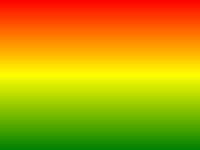
Следующий пример показывает, линейный градиент, который начинается в верхней части. Она начинается красный, переход на желтый, а затем на синий:
#grad {
background: -webkit-linear-gradient(red,yellow,blue); /* Safari 5.1-6.0 */
background: -o-linear-gradient(red,yellow,blue); /*
Opera 11.1-12.0 */
background: -moz-linear-gradient(red,yellow,blue); /*
Firefox 3.6-15 */
background: linear-gradient(red,yellow,blue); /* Standard
syntax */
}
Попробуй сам " Определение и использование
linear-gradient() функция создает "image" , который представляет собой линейный градиент цветов.
Чтобы создать линейный градиент, необходимо определить по крайней мере два цвета остановки. Цвет остановки цвета, которые вы хотите сделать плавные переходы между. Вы также можете установить начальную точку и направление (or an angle) наряду с эффектом градиента.
Пример линейного градиента:
| Версия: | CSS3 |
|---|
Поддержка браузеров
Числа в таблице указать первую версию браузера, который полностью поддерживает эту функцию.
Числа следуют -webkit-, -moz- или -O- указать первую версию, которая работала с приставкой.
| функция | |||||
|---|---|---|---|---|---|
| linear-gradient() | 26,0 10,0 -webkit- | 10,0 | 16,0 3.6 -moz- | 6.1 5.1 -webkit- | 12.1 11.1 -о- |
CSS Синтаксис
background: linear-gradient( direction , color-stop1 ,
color-stop2, ... );
| Стоимость | Описание |
|---|---|
| direction | Определяет начальную точку и направление (or an angle) наряду с эффектом градиента. |
| color-stop1, color-stop2,... | Цвет остановки цвета, которые вы хотите сделать плавные переходы между. Это значение состоит из значения цвета, за которым может следовать положение останова (a percentage between 0% and 100% or a length along the gradient axis) . |

Еще примеры
пример
Линейный градиент, который начинается с левой стороны. Она начинается красный, синий переходит к:
#grad {
background: -webkit-linear-gradient(left,
red , blue); /* Safari 5.1 to 6.0 */
background: -o-linear-gradient(right, red,
blue); /* Opera 11.1 to 12.0 */
background: -moz-linear-gradient(right,
red, blue); /* Firefox 3.6 to 15 */
background: linear-gradient(to
right, red , blue); /* Standard syntax */
} Попробуй сам " пример
Линейный градиент , который начинается в левом верхнем углу (and goes to bottom right) :
#grad {
background: -webkit-linear-gradient(left
top, red , blue); /* Safari 5.1 to 6.0 */
background: -o-linear-gradient(bottom
right, red, blue); /* Opera 11.1 to 12.0 */
background: -moz-linear-gradient(bottom
right, red, blue); /* Firefox 3.6 to 15 */
background:
linear-gradient(to bottom right, red , blue); /* Standard syntax */
} Попробуй сам " пример
Линейный градиент с определенным углом:
#grad {
background: -webkit-linear-gradient(180deg,
red, blue); /* Safari 5.1 to 6.0 */
background: -o-linear-gradient(180deg, red,
blue); /* Opera 11.1 to 12.0 */
background: -moz-linear-gradient(180deg,
red, blue); /* Firefox 3.6 to 15 */
background:
linear-gradient(180deg, red, blue); /* Standard syntax */
} Попробуй сам " пример
Линейный градиент с множеством цветовых остановок:
#grad {
/* For Safari 5.1 to 6.0 */
background: -webkit-linear-gradient(left,red,orange,yellow,green,blue,indigo,violet);
/* For Opera 11.1 to 12.0 */
background:
-o-linear-gradient(left,red,orange,yellow,green,blue,indigo,violet);
/*
For Fx 3.6 to 15 */
background: -moz-linear-gradient(left,red,orange,yellow,green,blue,indigo,violet);
/* Standard syntax */
background: linear-gradient(to right,
red,orange,yellow,green,blue,indigo,violet);
} Попробуй сам " пример
Линейный градиент с прозрачностью:
#grad {
background: -webkit-linear-gradient(left,rgba(255,0,0,0),rgba(255,0,0,1)); /*Safari
5.1-6*/
background:
-o-linear-gradient(right,rgba(255,0,0,0),rgba(255,0,0,1)); /*Opera 11.1-12*/
background: -moz-linear-gradient(right,rgba(255,0,0,0),rgba(255,0,0,1));
/*Fx 3.6-15*/
background: linear-gradient(to right, rgba(255,0,0,0),
rgba(255,0,0,1)); /*Standard*/
} Попробуй сам " Похожие страницы
Учебник CSS: CSS3 Градиенты
 Функции CSS Reference