Przykład
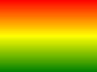
Poniższy przykład pokazuje, gradient liniowy, który zaczyna się na szczycie. Zaczyna czerwony, przejście na żółty, a następnie do niebieskiego:
#grad {
background: -webkit-linear-gradient(red,yellow,blue); /* Safari 5.1-6.0 */
background: -o-linear-gradient(red,yellow,blue); /*
Opera 11.1-12.0 */
background: -moz-linear-gradient(red,yellow,blue); /*
Firefox 3.6-15 */
background: linear-gradient(red,yellow,blue); /* Standard
syntax */
}
Spróbuj sam " Definicja i Wykorzystanie
linear-gradient() funkcji tworzy się "image" który stanowi liniowy gradient kolorów.
Aby utworzyć gradient liniowy musi zdefiniować przynajmniej dwa przystanki kolorów. Kolor przystanki są kolory, które chcesz uczynić płynne przejścia między. Można również ustawić punkt początkowy i kierunek (or an angle) wraz z efektem gradientu.
Przykład gradient liniowy:
| Wersja: | CSS3 |
|---|
Pomoc Browser
Liczby w tabeli określ pierwszą wersję przeglądarki, który w pełni obsługuje tę funkcję.
Liczby następnie -webkit-, -moz- lub -o- określić pierwszą wersję, która pracowała z prefiksem.
| Funkcjonować | |||||
|---|---|---|---|---|---|
| linear-gradient() | 26,0 10,0 -webkit- | 10,0 | 16,0 3,6 -moz- | 6,1 5,1 -webkit- | 12,1 11,1 -o- |
Składnia CSS
background: linear-gradient( direction , color-stop1 ,
color-stop2, ... );
| Wartość | Opis |
|---|---|
| direction | Określa się punkt początkowy i kierunek (or an angle) wraz z wpływem gradientu. |
| color-stop1, color-stop2,... | Kolor przystanki są kolory, które chcesz uczynić płynne przejścia między. Wartość ta składa się z wartości koloru, po opcjonalnym położeniu zatrzymania (a percentage between 0% and 100% or a length along the gradient axis) . |

Więcej przykładów
Przykład
Liniowy gradient, który rozpoczyna się z lewej strony. Zaczyna czerwony, przejście na niebiesko:
#grad {
background: -webkit-linear-gradient(left,
red , blue); /* Safari 5.1 to 6.0 */
background: -o-linear-gradient(right, red,
blue); /* Opera 11.1 to 12.0 */
background: -moz-linear-gradient(right,
red, blue); /* Firefox 3.6 to 15 */
background: linear-gradient(to
right, red , blue); /* Standard syntax */
} Spróbuj sam " Przykład
Gradientu liniowego, który rozpoczyna się w lewym górnym rogu (and goes to bottom right) :
#grad {
background: -webkit-linear-gradient(left
top, red , blue); /* Safari 5.1 to 6.0 */
background: -o-linear-gradient(bottom
right, red, blue); /* Opera 11.1 to 12.0 */
background: -moz-linear-gradient(bottom
right, red, blue); /* Firefox 3.6 to 15 */
background:
linear-gradient(to bottom right, red , blue); /* Standard syntax */
} Spróbuj sam " Przykład
Liniowy gradient określonym kątem:
#grad {
background: -webkit-linear-gradient(180deg,
red, blue); /* Safari 5.1 to 6.0 */
background: -o-linear-gradient(180deg, red,
blue); /* Opera 11.1 to 12.0 */
background: -moz-linear-gradient(180deg,
red, blue); /* Firefox 3.6 to 15 */
background:
linear-gradient(180deg, red, blue); /* Standard syntax */
} Spróbuj sam " Przykład
Gradient liniowy z wieloma przystankami kolorystycznych:
#grad {
/* For Safari 5.1 to 6.0 */
background: -webkit-linear-gradient(left,red,orange,yellow,green,blue,indigo,violet);
/* For Opera 11.1 to 12.0 */
background:
-o-linear-gradient(left,red,orange,yellow,green,blue,indigo,violet);
/*
For Fx 3.6 to 15 */
background: -moz-linear-gradient(left,red,orange,yellow,green,blue,indigo,violet);
/* Standard syntax */
background: linear-gradient(to right,
red,orange,yellow,green,blue,indigo,violet);
} Spróbuj sam " Przykład
Liniowy gradient przejrzystości:
#grad {
background: -webkit-linear-gradient(left,rgba(255,0,0,0),rgba(255,0,0,1)); /*Safari
5.1-6*/
background:
-o-linear-gradient(right,rgba(255,0,0,0),rgba(255,0,0,1)); /*Opera 11.1-12*/
background: -moz-linear-gradient(right,rgba(255,0,0,0),rgba(255,0,0,1));
/*Fx 3.6-15*/
background: linear-gradient(to right, rgba(255,0,0,0),
rgba(255,0,0,1)); /*Standard*/
} Spróbuj sam " Podobne strony
Kurs CSS: CSS3 Gradienty
 Funkcje CSS