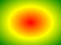
Beispiel
Eine radiale Gradienten mit gleichmäßig verteilten Farbstopps:
#grad {
background: -webkit-radial-gradient(red, green, blue); /*
Safari 5.1- 6.0 */
background: -o-radial-gradient(red, green, blue); /* Opera
11.6-12.0 */
background: -moz-radial-gradient(red, green, blue); /*
Firefox 3.6-15 */
background: radial-gradient(red, green, blue);
/* Standard syntax */
} Versuch es selber " Definition und Verwendung
Die radial-gradient() Funktion erzeugt ein "image" , die einen Gradienten von Farben repräsentiert von der Mitte des Gradienten ausstrahlen.
Ein radialer Gradient wird durch seine Mitte definiert.
einen radialen Gradienten zu erzeugen Sie mindestens zwei Farbstopps auch definieren müssen.
Beispiel für Radialsteigung:
| Version: | CSS3 |
|---|
Browser-Unterstützung
Die Zahlen in der Tabelle geben Sie die erste Browser-Version, die die Funktion voll unterstützt.
Zahlen, gefolgt von -webkit-, -moz- oder -o- die erste Version an, die mit einem Präfix gearbeitet.
| Funktion | |||||
|---|---|---|---|---|---|
| radial-gradient() | 26.0 10,0 -webkit- | 10.0 | 16.0 3.6 -moz- | 6.1 5.1 -webkit- | 12.1 11.6 -o- |
CSS-Syntax
background: radial-gradient( shape size at position, start-color, ..., last-color );
| Wert | Beschreibung |
|---|---|
| shape | Definiert die Form des Gradienten. Mögliche Werte:
|
| size | Definiert die Größe des Gradienten. Mögliche Werte:
|
| position | Definiert die Position des Gradienten. Die Standardeinstellung ist "center" |
| start-color, ..., last-color | Farbe Anschläge sind die Farben, die Sie unter fließende Übergänge zu machen möchten. Dieser Wert besteht aus einem Farbwert, gefolgt von einer optionalen Stopposition (a percentage between 0% and 100% or a length along the gradient axis) . |

Mehr Beispiele
Beispiel
Eine radiale Gradienten mit unterschiedlich gestufte Farbstopps:
#grad {
background: -webkit-radial-gradient(red 5%, green 15%, blue
60%); /*
Safari 5.1-6.0 */
background: -o-radial-gradient(red 5%, green 15%, blue 60%); /* Opera
11.6-12.0 */
background: -moz-radial-gradient(red 5%, green 15%, blue 60%); /*
Firefox 3.6-15 */
background: radial-gradient(red 5%, green 15%, blue
60%);
/* Standard syntax */
} Versuch es selber " Beispiel
Eine radiale Gradienten mit der Form eines Kreises:
#grad {
background: -webkit-radial-gradient(circle, red, yellow, green); /*
Safari */
background: -o-radial-gradient(circle, red, yellow, green); /* Opera
11.6 to 12.0 */
background: -moz-radial-gradient(circle, red, yellow,
green); /* Firefox 3.6 to 15 */
background: radial-gradient(circle, red,
yellow, green);
/* Standard syntax */
} Versuch es selber " Beispiel
Eine radiale Gradienten mit unterschiedlicher Größe keywords:
#grad1 {
/* Safari 5.1 to 6.0 */
background: -webkit-radial-gradient(60%
55%, closest-side,blue,green,yellow,black);
/* For Opera 11.6 to 12.0 */
background: -o-radial-gradient(60% 55%, closest-side,blue,green,yellow,black);
/* For Firefox 3.6 to 15 */
background: -moz-radial-gradient(60% 55%,
closest-side,blue,green,yellow,black);
/* Standard syntax */
background: radial-gradient(closest-side at 60% 55%,blue,green,yellow,black);
}
#grad2 {
/* Safari 5.1 to 6.0 */
background: -webkit-radial-gradient(60% 55%, farthest-side,blue,green,yellow,black);
/* Opera 11.6 to 12.0 */
background: -o-radial-gradient(60% 55%,
farthest-side,blue,green,yellow,black);
/* For Firefox 3.6 to 15 */
background: -moz-radial-gradient(60% 55%, farthest-side,blue,green,yellow,black);
/* Standard syntax */
background: radial-gradient(farthest-side at 60%
55%,blue,green,yellow,black);
} Versuch es selber " Verwandte Seiten
CSS Tutorial: CSS3 Gradients
 CSS - Funktionen Referenz