예
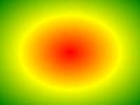
균등 색상 정지와 방사형 그라데이션 :
#grad {
background: -webkit-radial-gradient(red, green, blue); /*
Safari 5.1- 6.0 */
background: -o-radial-gradient(red, green, blue); /* Opera
11.6-12.0 */
background: -moz-radial-gradient(red, green, blue); /*
Firefox 3.6-15 */
background: radial-gradient(red, green, blue);
/* Standard syntax */
} »그것을 자신을 시도 정의 및 사용
radial-gradient() 함수는 생성 "image" 그래디언트의 중심으로부터 방사 색상의 구배를 나타낸다.
방사형 그라디언트는 그 중심에 의해 정의된다.
당신은 또한 두 개 이상의 색상 정지를 정의해야 방사형 그라디언트를 만들 수 있습니다.
방사형 그라데이션의 예 :
| 번역: | CSS3 |
|---|
브라우저 지원
표의 수치는 완전히 기능을 지원하는 제 브라우저 버전을 지정.
숫자는 -moz-, -webkit- 다음에, 또는 접두어와 함께 일 첫 번째 버전을 지정 -O-.
| 기능 | |||||
|---|---|---|---|---|---|
| radial-gradient() | 26.0 10.0 -webkit- | 10.0 | 16.0 3.6 -moz- | 6.1 5.1 -webkit- | 12.1 11.6 -O- |
CSS 구문
background: radial-gradient( shape size at position, start-color, ..., last-color );
| 값 | 기술 |
|---|---|
| shape | 그라디언트의 모양을 정의합니다. 가능한 값 :
|
| size | 그라디언트의 크기를 정의합니다. 가능한 값 :
|
| position | 그라디언트의 위치를 정의합니다. 기본값은 "center" |
| start-color, ..., last-color | 색상 정지는 사이에 부드러운 전환을 렌더링 할 색상입니다. 이 값은 임의의 정지 위치 뒤에 컬러 값, 구성 (a percentage between 0% and 100% or a length along the gradient axis) . |

더 예
예
다른 간격 색상 정지와 방사형 그라데이션 :
#grad {
background: -webkit-radial-gradient(red 5%, green 15%, blue
60%); /*
Safari 5.1-6.0 */
background: -o-radial-gradient(red 5%, green 15%, blue 60%); /* Opera
11.6-12.0 */
background: -moz-radial-gradient(red 5%, green 15%, blue 60%); /*
Firefox 3.6-15 */
background: radial-gradient(red 5%, green 15%, blue
60%);
/* Standard syntax */
} »그것을 자신을 시도 예
원의 모양 방사형 그라데이션 :
#grad {
background: -webkit-radial-gradient(circle, red, yellow, green); /*
Safari */
background: -o-radial-gradient(circle, red, yellow, green); /* Opera
11.6 to 12.0 */
background: -moz-radial-gradient(circle, red, yellow,
green); /* Firefox 3.6 to 15 */
background: radial-gradient(circle, red,
yellow, green);
/* Standard syntax */
} »그것을 자신을 시도 예
다른 크기의 키워드를 방사형 그라데이션 :
#grad1 {
/* Safari 5.1 to 6.0 */
background: -webkit-radial-gradient(60%
55%, closest-side,blue,green,yellow,black);
/* For Opera 11.6 to 12.0 */
background: -o-radial-gradient(60% 55%, closest-side,blue,green,yellow,black);
/* For Firefox 3.6 to 15 */
background: -moz-radial-gradient(60% 55%,
closest-side,blue,green,yellow,black);
/* Standard syntax */
background: radial-gradient(closest-side at 60% 55%,blue,green,yellow,black);
}
#grad2 {
/* Safari 5.1 to 6.0 */
background: -webkit-radial-gradient(60% 55%, farthest-side,blue,green,yellow,black);
/* Opera 11.6 to 12.0 */
background: -o-radial-gradient(60% 55%,
farthest-side,blue,green,yellow,black);
/* For Firefox 3.6 to 15 */
background: -moz-radial-gradient(60% 55%, farthest-side,blue,green,yellow,black);
/* Standard syntax */
background: radial-gradient(farthest-side at 60%
55%,blue,green,yellow,black);
} »그것을 자신을 시도 관련 페이지
CSS 자습서 : CSS3 그라디언트
 CSS 기능 참조