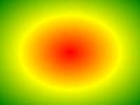
例
等間隔のカラーストップで放射状グラデーション:
#grad {
background: -webkit-radial-gradient(red, green, blue); /*
Safari 5.1- 6.0 */
background: -o-radial-gradient(red, green, blue); /* Opera
11.6-12.0 */
background: -moz-radial-gradient(red, green, blue); /*
Firefox 3.6-15 */
background: radial-gradient(red, green, blue);
/* Standard syntax */
} »それを自分で試してみてください 定義と使用法
radial-gradient()関数が作成され"image"グラデーションの中心から放射状に色のグラデーションを表します。
放射状グラデーションは、その中心で定義されています。
放射状のグラデーションを作成するには、少なくとも2カラーストップを定義する必要があります。
放射状グラデーションの例:
| バージョン: | CSS3 |
|---|
ブラウザのサポート
表中の数字は完全に機能をサポートする最初のブラウザのバージョンを指定します。
-webkit-続い番号、-moz-、または接頭辞で働いていた最初のバージョンを指定して-O-です。
| 関数 | |||||
|---|---|---|---|---|---|
| radial-gradient() | 26.0 10.0 -webkit- | 10.0 | 16.0 3.6 -moz- | 6.1 5.1 -webkit- | 12.1 11.6 -O- |
CSSの構文
background: radial-gradient( shape size at position, start-color, ..., last-color );
| 値 | 説明 |
|---|---|
| shape | 勾配の形状を定義します。 可能な値:
|
| size | グラデーションのサイズを定義します。 可能な値:
|
| position | 勾配の位置を定義します。 デフォルトは"center" |
| start-color, ..., last-color | カラーストップを使用すると、の間で円滑な移行をレンダリングする色です。 この値は、任意の停止位置に続くカラー値からなる(a percentage between 0% and 100% or a length along the gradient axis) 。 |

その他の例
例
異なる間隔を置いたカラーストップで放射状グラデーション:
#grad {
background: -webkit-radial-gradient(red 5%, green 15%, blue
60%); /*
Safari 5.1-6.0 */
background: -o-radial-gradient(red 5%, green 15%, blue 60%); /* Opera
11.6-12.0 */
background: -moz-radial-gradient(red 5%, green 15%, blue 60%); /*
Firefox 3.6-15 */
background: radial-gradient(red 5%, green 15%, blue
60%);
/* Standard syntax */
} »それを自分で試してみてください 例
円の形状に放射状の勾配:
#grad {
background: -webkit-radial-gradient(circle, red, yellow, green); /*
Safari */
background: -o-radial-gradient(circle, red, yellow, green); /* Opera
11.6 to 12.0 */
background: -moz-radial-gradient(circle, red, yellow,
green); /* Firefox 3.6 to 15 */
background: radial-gradient(circle, red,
yellow, green);
/* Standard syntax */
} »それを自分で試してみてください 例
異なるサイズのキーワードで放射状のグラデーション:
#grad1 {
/* Safari 5.1 to 6.0 */
background: -webkit-radial-gradient(60%
55%, closest-side,blue,green,yellow,black);
/* For Opera 11.6 to 12.0 */
background: -o-radial-gradient(60% 55%, closest-side,blue,green,yellow,black);
/* For Firefox 3.6 to 15 */
background: -moz-radial-gradient(60% 55%,
closest-side,blue,green,yellow,black);
/* Standard syntax */
background: radial-gradient(closest-side at 60% 55%,blue,green,yellow,black);
}
#grad2 {
/* Safari 5.1 to 6.0 */
background: -webkit-radial-gradient(60% 55%, farthest-side,blue,green,yellow,black);
/* Opera 11.6 to 12.0 */
background: -o-radial-gradient(60% 55%,
farthest-side,blue,green,yellow,black);
/* For Firefox 3.6 to 15 */
background: -moz-radial-gradient(60% 55%, farthest-side,blue,green,yellow,black);
/* Standard syntax */
background: radial-gradient(farthest-side at 60%
55%,blue,green,yellow,black);
} »それを自分で試してみてください 関連ページ
CSSチュートリアル: CSS3グラデーション
 CSS関数リファレンス