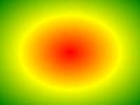
Contoh
Sebuah gradien radial dengan berhenti warna merata spasi:
#grad {
background: -webkit-radial-gradient(red, green, blue); /*
Safari 5.1- 6.0 */
background: -o-radial-gradient(red, green, blue); /* Opera
11.6-12.0 */
background: -moz-radial-gradient(red, green, blue); /*
Firefox 3.6-15 */
background: radial-gradient(red, green, blue);
/* Standard syntax */
} Cobalah sendiri " Definisi dan Penggunaan
The radial-gradient() fungsi menciptakan "image" yang merupakan gradien warna memancar dari pusat gradien.
Sebuah gradien radial didefinisikan oleh pusatnya.
Untuk membuat gradien radial Anda juga harus menentukan setidaknya dua berhenti warna.
Contoh Radial Gradient:
| Versi: | CSS3 |
|---|
Dukungan Browser
Angka-angka dalam tabel menentukan versi browser pertama yang sepenuhnya mendukung fungsi.
Nomor diikuti oleh -webkit-, moz, atau -o- menentukan versi pertama yang bekerja dengan awalan.
| Fungsi | |||||
|---|---|---|---|---|---|
| radial-gradient() | 26,0 10,0 -webkit- | 10,0 | 16.0 3.6 moz | 6.1 5.1 -webkit- | 12.1 11,6 -o- |
CSS Syntax
background: radial-gradient( shape size at position, start-color, ..., last-color );
| Nilai | Deskripsi |
|---|---|
| shape | Mendefinisikan bentuk gradien. Kemungkinan nilai:
|
| size | Mendefinisikan ukuran gradien. Kemungkinan nilai:
|
| position | Mendefinisikan posisi gradien. Default adalah "center" |
| start-color, ..., last-color | berhenti warna warna yang Anda inginkan untuk membuat transisi halus antara. Nilai ini terdiri dari nilai warna, diikuti oleh berhenti posisi opsional (a percentage between 0% and 100% or a length along the gradient axis) . |

Contoh lebih
Contoh
Sebuah gradien radial dengan berhenti warna berbeda spasi:
#grad {
background: -webkit-radial-gradient(red 5%, green 15%, blue
60%); /*
Safari 5.1-6.0 */
background: -o-radial-gradient(red 5%, green 15%, blue 60%); /* Opera
11.6-12.0 */
background: -moz-radial-gradient(red 5%, green 15%, blue 60%); /*
Firefox 3.6-15 */
background: radial-gradient(red 5%, green 15%, blue
60%);
/* Standard syntax */
} Cobalah sendiri " Contoh
Sebuah gradien radial dengan bentuk lingkaran:
#grad {
background: -webkit-radial-gradient(circle, red, yellow, green); /*
Safari */
background: -o-radial-gradient(circle, red, yellow, green); /* Opera
11.6 to 12.0 */
background: -moz-radial-gradient(circle, red, yellow,
green); /* Firefox 3.6 to 15 */
background: radial-gradient(circle, red,
yellow, green);
/* Standard syntax */
} Cobalah sendiri " Contoh
Sebuah gradien radial dengan kata kunci ukuran yang berbeda:
#grad1 {
/* Safari 5.1 to 6.0 */
background: -webkit-radial-gradient(60%
55%, closest-side,blue,green,yellow,black);
/* For Opera 11.6 to 12.0 */
background: -o-radial-gradient(60% 55%, closest-side,blue,green,yellow,black);
/* For Firefox 3.6 to 15 */
background: -moz-radial-gradient(60% 55%,
closest-side,blue,green,yellow,black);
/* Standard syntax */
background: radial-gradient(closest-side at 60% 55%,blue,green,yellow,black);
}
#grad2 {
/* Safari 5.1 to 6.0 */
background: -webkit-radial-gradient(60% 55%, farthest-side,blue,green,yellow,black);
/* Opera 11.6 to 12.0 */
background: -o-radial-gradient(60% 55%,
farthest-side,blue,green,yellow,black);
/* For Firefox 3.6 to 15 */
background: -moz-radial-gradient(60% 55%, farthest-side,blue,green,yellow,black);
/* Standard syntax */
background: radial-gradient(farthest-side at 60%
55%,blue,green,yellow,black);
} Cobalah sendiri " Pages terkait
CSS tutorial: CSS3 Gradien
 CSS Fungsi Referensi