Contoh
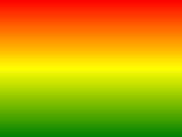
Contoh berikut menunjukkan gradien linier yang dimulai di bagian atas. Dimulai merah, transisi ke kuning, kemudian ke biru:
#grad {
background: -webkit-linear-gradient(red,yellow,blue); /* Safari 5.1-6.0 */
background: -o-linear-gradient(red,yellow,blue); /*
Opera 11.1-12.0 */
background: -moz-linear-gradient(red,yellow,blue); /*
Firefox 3.6-15 */
background: linear-gradient(red,yellow,blue); /* Standard
syntax */
}
Cobalah sendiri " Definisi dan Penggunaan
The linear-gradient() fungsi menciptakan "image" yang merupakan gradien linier warna.
Untuk membuat gradien linier Anda harus menentukan setidaknya dua berhenti warna. berhenti warna warna yang Anda inginkan untuk membuat transisi halus antara. Anda juga dapat mengatur titik awal dan arah (or an angle) bersama dengan efek gradien.
Contoh Linear Gradient:
| Versi: | CSS3 |
|---|
Dukungan Browser
Angka-angka dalam tabel menentukan versi browser pertama yang sepenuhnya mendukung fungsi.
Nomor diikuti oleh -webkit-, moz, atau -o- menentukan versi pertama yang bekerja dengan awalan.
| Fungsi | |||||
|---|---|---|---|---|---|
| linear-gradient() | 26,0 10,0 -webkit- | 10,0 | 16.0 3.6 moz | 6.1 5.1 -webkit- | 12.1 11.1 -o- |
CSS Syntax
background: linear-gradient( direction , color-stop1 ,
color-stop2, ... );
| Nilai | Deskripsi |
|---|---|
| direction | Mendefinisikan titik awal dan arah (or an angle) bersama dengan efek gradien. |
| color-stop1, color-stop2,... | berhenti warna warna yang Anda inginkan untuk membuat transisi halus antara. Nilai ini terdiri dari nilai warna, diikuti oleh berhenti posisi opsional (a percentage between 0% and 100% or a length along the gradient axis) . |

Contoh lebih
Contoh
Sebuah gradien linier yang dimulai dari kiri. Dimulai merah, transisi ke biru:
#grad {
background: -webkit-linear-gradient(left,
red , blue); /* Safari 5.1 to 6.0 */
background: -o-linear-gradient(right, red,
blue); /* Opera 11.1 to 12.0 */
background: -moz-linear-gradient(right,
red, blue); /* Firefox 3.6 to 15 */
background: linear-gradient(to
right, red , blue); /* Standard syntax */
} Cobalah sendiri " Contoh
Sebuah gradien linier yang dimulai pada kiri atas (and goes to bottom right) :
#grad {
background: -webkit-linear-gradient(left
top, red , blue); /* Safari 5.1 to 6.0 */
background: -o-linear-gradient(bottom
right, red, blue); /* Opera 11.1 to 12.0 */
background: -moz-linear-gradient(bottom
right, red, blue); /* Firefox 3.6 to 15 */
background:
linear-gradient(to bottom right, red , blue); /* Standard syntax */
} Cobalah sendiri " Contoh
Sebuah gradien linier dengan sudut tertentu:
#grad {
background: -webkit-linear-gradient(180deg,
red, blue); /* Safari 5.1 to 6.0 */
background: -o-linear-gradient(180deg, red,
blue); /* Opera 11.1 to 12.0 */
background: -moz-linear-gradient(180deg,
red, blue); /* Firefox 3.6 to 15 */
background:
linear-gradient(180deg, red, blue); /* Standard syntax */
} Cobalah sendiri " Contoh
Sebuah gradien linier dengan beberapa berhenti warna:
#grad {
/* For Safari 5.1 to 6.0 */
background: -webkit-linear-gradient(left,red,orange,yellow,green,blue,indigo,violet);
/* For Opera 11.1 to 12.0 */
background:
-o-linear-gradient(left,red,orange,yellow,green,blue,indigo,violet);
/*
For Fx 3.6 to 15 */
background: -moz-linear-gradient(left,red,orange,yellow,green,blue,indigo,violet);
/* Standard syntax */
background: linear-gradient(to right,
red,orange,yellow,green,blue,indigo,violet);
} Cobalah sendiri " Contoh
Sebuah gradien linier dengan transparansi:
#grad {
background: -webkit-linear-gradient(left,rgba(255,0,0,0),rgba(255,0,0,1)); /*Safari
5.1-6*/
background:
-o-linear-gradient(right,rgba(255,0,0,0),rgba(255,0,0,1)); /*Opera 11.1-12*/
background: -moz-linear-gradient(right,rgba(255,0,0,0),rgba(255,0,0,1));
/*Fx 3.6-15*/
background: linear-gradient(to right, rgba(255,0,0,0),
rgba(255,0,0,1)); /*Standard*/
} Cobalah sendiri " Pages terkait
CSS tutorial: CSS3 Gradien
 CSS Fungsi Referensi