Exemple
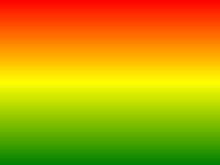
L'exemple suivant montre un gradient linéaire qui commence au sommet. Il commence rouge, la transition vers le jaune, puis au bleu:
#grad {
background: -webkit-linear-gradient(red,yellow,blue); /* Safari 5.1-6.0 */
background: -o-linear-gradient(red,yellow,blue); /*
Opera 11.1-12.0 */
background: -moz-linear-gradient(red,yellow,blue); /*
Firefox 3.6-15 */
background: linear-gradient(red,yellow,blue); /* Standard
syntax */
}
Essayez - le vous - même » Définition et utilisation
Le linear-gradient() fonction crée une "image" qui représente un gradient linéaire de couleurs.
Pour créer un dégradé linéaire, vous devez définir au moins deux butées de couleur. arrêts de couleurs sont les couleurs que vous souhaitez rendre des transitions en douceur entre. Vous pouvez également définir un point de départ et une direction (or an angle) ainsi que l'effet de dégradé.
Exemple de dégradé linéaire:
| Version: | CSS3 |
|---|
support du navigateur
Les chiffres du tableau indiquent la première version du navigateur qui prend en charge pleinement la fonction.
Numbers suivis par -webkit-, -moz-, ou -O- précisent la première version qui a travaillé avec un préfixe.
| Fonction | |||||
|---|---|---|---|---|---|
| linear-gradient() | 26,0 10.0 -webkit- | 10.0 | 16,0 3.6 -moz- | 6.1 5.1 -webkit- | 12.1 11.1 -o- |
Syntaxe CSS
background: linear-gradient( direction , color-stop1 ,
color-stop2, ... );
| Valeur | La description |
|---|---|
| direction | Définit un point de départ et une direction (or an angle) ainsi que l'effet de dégradé. |
| color-stop1, color-stop2,... | arrêts de couleurs sont les couleurs que vous souhaitez rendre des transitions en douceur entre. Cette valeur se compose d'une valeur de couleur, suivie d'une position d'arrêt facultatif (a percentage between 0% and 100% or a length along the gradient axis) le (a percentage between 0% and 100% or a length along the gradient axis) de (a percentage between 0% and 100% or a length along the gradient axis) . |

Autres exemples
Exemple
Un gradient linéaire commençant par la gauche. Il commence rouge, la transition vers le bleu:
#grad {
background: -webkit-linear-gradient(left,
red , blue); /* Safari 5.1 to 6.0 */
background: -o-linear-gradient(right, red,
blue); /* Opera 11.1 to 12.0 */
background: -moz-linear-gradient(right,
red, blue); /* Firefox 3.6 to 15 */
background: linear-gradient(to
right, red , blue); /* Standard syntax */
} Essayez - le vous - même » Exemple
Un gradient linéaire qui commence en haut à gauche (and goes to bottom right) en (and goes to bottom right) à (and goes to bottom right) :
#grad {
background: -webkit-linear-gradient(left
top, red , blue); /* Safari 5.1 to 6.0 */
background: -o-linear-gradient(bottom
right, red, blue); /* Opera 11.1 to 12.0 */
background: -moz-linear-gradient(bottom
right, red, blue); /* Firefox 3.6 to 15 */
background:
linear-gradient(to bottom right, red , blue); /* Standard syntax */
} Essayez - le vous - même » Exemple
Un gradient linéaire avec un angle spécifié:
#grad {
background: -webkit-linear-gradient(180deg,
red, blue); /* Safari 5.1 to 6.0 */
background: -o-linear-gradient(180deg, red,
blue); /* Opera 11.1 to 12.0 */
background: -moz-linear-gradient(180deg,
red, blue); /* Firefox 3.6 to 15 */
background:
linear-gradient(180deg, red, blue); /* Standard syntax */
} Essayez - le vous - même » Exemple
Un gradient linéaire avec plusieurs arrêts de couleurs:
#grad {
/* For Safari 5.1 to 6.0 */
background: -webkit-linear-gradient(left,red,orange,yellow,green,blue,indigo,violet);
/* For Opera 11.1 to 12.0 */
background:
-o-linear-gradient(left,red,orange,yellow,green,blue,indigo,violet);
/*
For Fx 3.6 to 15 */
background: -moz-linear-gradient(left,red,orange,yellow,green,blue,indigo,violet);
/* Standard syntax */
background: linear-gradient(to right,
red,orange,yellow,green,blue,indigo,violet);
} Essayez - le vous - même » Exemple
Un gradient linéaire avec transparence:
#grad {
background: -webkit-linear-gradient(left,rgba(255,0,0,0),rgba(255,0,0,1)); /*Safari
5.1-6*/
background:
-o-linear-gradient(right,rgba(255,0,0,0),rgba(255,0,0,1)); /*Opera 11.1-12*/
background: -moz-linear-gradient(right,rgba(255,0,0,0),rgba(255,0,0,1));
/*Fx 3.6-15*/
background: linear-gradient(to right, rgba(255,0,0,0),
rgba(255,0,0,1)); /*Standard*/
} Essayez - le vous - même » Pages associées
CSS tutoriel: CSS3 Dégradés
 Fonctions CSS Référence