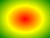
Ejemplo
Un gradiente radial con paradas de color uniformemente espaciadas:
#grad {
background: -webkit-radial-gradient(red, green, blue); /*
Safari 5.1- 6.0 */
background: -o-radial-gradient(red, green, blue); /* Opera
11.6-12.0 */
background: -moz-radial-gradient(red, green, blue); /*
Firefox 3.6-15 */
background: radial-gradient(red, green, blue);
/* Standard syntax */
} Inténtalo tú mismo " Definición y Uso
El radial-gradient() función crea una "image" que representa una gradación de colores que irradian desde el centro de la pendiente.
Un degradado radial se define por su centro.
Para crear un degradado radial también debe definir al menos dos etapas de color.
Ejemplo de la parte radial:
| Versión: | CSS3 |
|---|
Soporte para el navegador
Los números de la tabla especifican la primera versión del navegador que es totalmente compatible con la función.
Los números seguidos por -webkit-, -moz-, o -O- especifican la primera versión que funcionaba con un prefijo.
| Función | |||||
|---|---|---|---|---|---|
| radial-gradient() | 26.0 10.0 -webkit- | 10.0 | 16.0 3.6 -moz- | 6.1 5.1 -webkit- | 12.1 11.6 -o- |
sintaxis CSS
background: radial-gradient( shape size at position, start-color, ..., last-color );
| Valor | Descripción |
|---|---|
| shape | Define la forma del gradiente. Valores posibles:
|
| size | Define el tamaño de la pendiente. Valores posibles:
|
| position | Define la posición de la pendiente. El valor predeterminado es "center" |
| start-color, ..., last-color | paradas de color son los colores que desee para hacer transiciones suaves entre. Este valor se compone de un valor de color, seguida de una posición de tope opcional (a percentage between 0% and 100% or a length along the gradient axis) . |

Más ejemplos
Ejemplo
Un gradiente radial con paradas de color diferente espaciados:
#grad {
background: -webkit-radial-gradient(red 5%, green 15%, blue
60%); /*
Safari 5.1-6.0 */
background: -o-radial-gradient(red 5%, green 15%, blue 60%); /* Opera
11.6-12.0 */
background: -moz-radial-gradient(red 5%, green 15%, blue 60%); /*
Firefox 3.6-15 */
background: radial-gradient(red 5%, green 15%, blue
60%);
/* Standard syntax */
} Inténtalo tú mismo " Ejemplo
Un gradiente radial con la forma de un círculo:
#grad {
background: -webkit-radial-gradient(circle, red, yellow, green); /*
Safari */
background: -o-radial-gradient(circle, red, yellow, green); /* Opera
11.6 to 12.0 */
background: -moz-radial-gradient(circle, red, yellow,
green); /* Firefox 3.6 to 15 */
background: radial-gradient(circle, red,
yellow, green);
/* Standard syntax */
} Inténtalo tú mismo " Ejemplo
Un gradiente radial con diferentes palabras clave tamaño:
#grad1 {
/* Safari 5.1 to 6.0 */
background: -webkit-radial-gradient(60%
55%, closest-side,blue,green,yellow,black);
/* For Opera 11.6 to 12.0 */
background: -o-radial-gradient(60% 55%, closest-side,blue,green,yellow,black);
/* For Firefox 3.6 to 15 */
background: -moz-radial-gradient(60% 55%,
closest-side,blue,green,yellow,black);
/* Standard syntax */
background: radial-gradient(closest-side at 60% 55%,blue,green,yellow,black);
}
#grad2 {
/* Safari 5.1 to 6.0 */
background: -webkit-radial-gradient(60% 55%, farthest-side,blue,green,yellow,black);
/* Opera 11.6 to 12.0 */
background: -o-radial-gradient(60% 55%,
farthest-side,blue,green,yellow,black);
/* For Firefox 3.6 to 15 */
background: -moz-radial-gradient(60% 55%, farthest-side,blue,green,yellow,black);
/* Standard syntax */
background: radial-gradient(farthest-side at 60%
55%,blue,green,yellow,black);
} Inténtalo tú mismo " Páginas relacionadas
CSS tutorial: CSS3 gradientes
 Funciones Referencia CSS