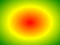
مثال
وتدرج شعاعي مع نقاط اللون متباعدة بشكل متساو:
#grad {
background: -webkit-radial-gradient(red, green, blue); /*
Safari 5.1- 6.0 */
background: -o-radial-gradient(red, green, blue); /* Opera
11.6-12.0 */
background: -moz-radial-gradient(red, green, blue); /*
Firefox 3.6-15 */
background: radial-gradient(red, green, blue);
/* Standard syntax */
} انها محاولة لنفسك » تعريف واستخدام
و radial-gradient() وظيفة يخلق "image" الذي يمثل أحد درجات الألوان يشع من وسط التدرج.
ويعرف شعاعي الانحدار من وسطها.
لإنشاء تدرج شعاعي يجب أيضا تحديد اثنين على الأقل توقف اللون.
مثال شعاعي الانحدار:
| الإصدار: | CSS3 |
|---|
دعم المتصفح
الأرقام في الجدول تحدد أول نسخة متصفح يدعم بشكل كامل وظيفة.
أرقام تليها -webkit-، -moz-، أو -o- تحدد النسخة الأولى التي عملت مع بادئة.
| وظيفة | |||||
|---|---|---|---|---|---|
| radial-gradient() | 26.0 10.0 -webkit- | 10.0 | 16.0 3.6 -moz- | 6.1 5.1 -webkit- | 12.1 11.6 -o- |
CSS بناء الجملة
background: radial-gradient( shape size at position, start-color, ..., last-color );
| القيمة | وصف |
|---|---|
| shape | يحدد شكل التدرج. القيم الممكنة:
|
| size | يحدد حجم الانحدار. القيم الممكنة:
|
| position | يحدد موقف التدرج. الافتراضي هو "center" |
| start-color, ..., last-color | توقف اللون هي الألوان التي تريد أن تجعل الانتقال السلس بين. وتتألف هذه القيمة من قيمة اللون، يعقبه وقف موقف اختياري (a percentage between 0% and 100% or a length along the gradient axis) . |

مزيد من الأمثلة
مثال
وتدرج شعاعي مع نقاط اللون متباعدة بشكل مختلف:
#grad {
background: -webkit-radial-gradient(red 5%, green 15%, blue
60%); /*
Safari 5.1-6.0 */
background: -o-radial-gradient(red 5%, green 15%, blue 60%); /* Opera
11.6-12.0 */
background: -moz-radial-gradient(red 5%, green 15%, blue 60%); /*
Firefox 3.6-15 */
background: radial-gradient(red 5%, green 15%, blue
60%);
/* Standard syntax */
} انها محاولة لنفسك » مثال
وتدرج شعاعي مع شكل دائرة:
#grad {
background: -webkit-radial-gradient(circle, red, yellow, green); /*
Safari */
background: -o-radial-gradient(circle, red, yellow, green); /* Opera
11.6 to 12.0 */
background: -moz-radial-gradient(circle, red, yellow,
green); /* Firefox 3.6 to 15 */
background: radial-gradient(circle, red,
yellow, green);
/* Standard syntax */
} انها محاولة لنفسك » مثال
وتدرج شعاعي مع كلمات مختلفة الحجم:
#grad1 {
/* Safari 5.1 to 6.0 */
background: -webkit-radial-gradient(60%
55%, closest-side,blue,green,yellow,black);
/* For Opera 11.6 to 12.0 */
background: -o-radial-gradient(60% 55%, closest-side,blue,green,yellow,black);
/* For Firefox 3.6 to 15 */
background: -moz-radial-gradient(60% 55%,
closest-side,blue,green,yellow,black);
/* Standard syntax */
background: radial-gradient(closest-side at 60% 55%,blue,green,yellow,black);
}
#grad2 {
/* Safari 5.1 to 6.0 */
background: -webkit-radial-gradient(60% 55%, farthest-side,blue,green,yellow,black);
/* Opera 11.6 to 12.0 */
background: -o-radial-gradient(60% 55%,
farthest-side,blue,green,yellow,black);
/* For Firefox 3.6 to 15 */
background: -moz-radial-gradient(60% 55%, farthest-side,blue,green,yellow,black);
/* Standard syntax */
background: radial-gradient(farthest-side at 60%
55%,blue,green,yellow,black);
} انها محاولة لنفسك » صفحات ذات صلة
درس CSS: CSS3 التدرجات
 وظائف CSS المرجعي